Color is one of the most powerful tools in your styling arsenal. The right color combinations can enhance your natural features, convey your mood, and even influence how others perceive you. But with so many possible combinations, how do you know which colors work best together and which are appropriate for different seasons?
Understanding Color Theory Basics
Before diving into seasonal color coordination, it's helpful to understand some color theory fundamentals:
- Color Wheel: The traditional color wheel consists of primary colors (red, blue, yellow), secondary colors (green, orange, purple), and tertiary colors (mixtures of primary and secondary).
- Complementary Colors: Colors opposite each other on the color wheel (e.g., blue and orange) create high contrast and visual impact when paired.
- Analogous Colors: Colors that sit next to each other on the color wheel (e.g., blue, blue-green, and green) create harmonious, low-contrast combinations.
- Monochromatic: Different shades, tints, and tones of a single color create subtle, sophisticated looks.
- Triadic: Three colors equally spaced around the color wheel create a balanced yet vibrant combination.
Seasonal Color Coordination
Spring: Fresh and Vibrant
Spring is all about renewal and fresh beginnings. The palette for spring typically includes:
- Soft pastels like blush pink, mint green, and sky blue
- Bright, clear colors like coral, turquoise, and lemon yellow
- Light neutrals such as ivory, beige, and light gray
Spring Combinations That Work:
- Mint green and coral create a fresh, energetic pairing
- Pastel yellow and sky blue offer a subtle contrast that feels light and airy
- White with any bright spring color creates a clean, crisp look

Summer: Soft and Muted
Summer color palettes tend to be softer and more muted than spring, with less contrast:
- Soft, cool colors like lavender, powder blue, and rose pink
- Muted brights like cornflower blue, raspberry, and sage green
- Light to medium neutrals like taupe, soft gray, and navy
Summer Combinations That Work:
- Lavender and sage green create a soothing, elegant pairing
- Navy and rose pink offer a classic contrast with a summer twist
- All-white outfits with subtle texture differences epitomize summer sophistication

Autumn: Rich and Warm
Autumn colors reflect the changing leaves and harvest season:
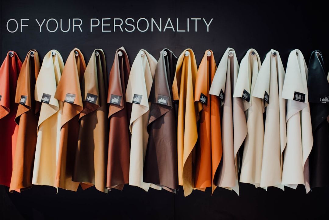
- Warm, rich colors like rust, mustard yellow, and olive green
- Deep jewel tones such as burgundy, forest green, and amber
- Warm neutrals including camel, chocolate brown, and cream
Autumn Combinations That Work:
- Burgundy and mustard create a rich, autumnal contrast
- Camel and forest green offer a sophisticated fall pairing
- Layering multiple shades of brown creates depth and visual interest

Winter: Bold and Dramatic
Winter color palettes are characterized by high contrast and clear, intense colors:
- Bold, clear colors like royal blue, emerald green, and true red
- Icy tones such as winter white, silver, and ice blue
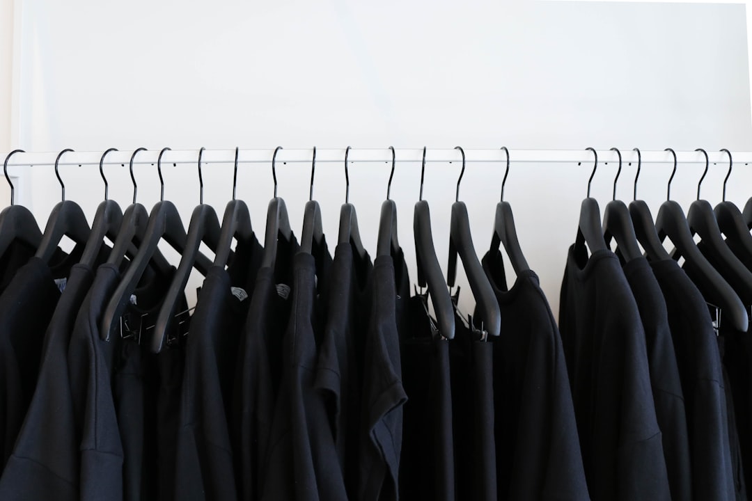
- High-contrast neutrals including black, charcoal, and white
Winter Combinations That Work:
- Black and white create the ultimate high-contrast winter look
- Emerald green and ruby red offer a festive yet sophisticated pairing
- Winter white and ice blue create an elegant, cool-toned monochromatic look

Color Coordination for Your Personal Coloring
While seasonal color trends provide helpful guidelines, it's also important to consider your personal coloring—your skin tone, hair color, and eye color—when choosing colors to wear.
Generally, people fall into one of four seasonal color types:
- Spring: Warm and light coloring (golden blonde hair, warm skin tones)
- Summer: Cool and light coloring (ash blonde hair, pink or blue undertones in skin)
- Autumn: Warm and deep coloring (auburn hair, warm skin tones)
- Winter: Cool and deep coloring (dark hair, cool skin tones)
The colors that naturally occur in your features are often the ones that will look most harmonious when worn near your face.
Advanced Color Coordination Tips
- The 60-30-10 Rule: Use your dominant color for about 60% of your outfit, a secondary color for about 30%, and an accent color for the remaining 10%.
- Use Neutrals as Anchors: When experimenting with bold color combinations, include neutral pieces to anchor the look.
- Consider Texture: Different textures can change how a color appears and how colors interact with each other. Matte, shiny, and textured surfaces of the same color can create subtle depth.
- Think About Occasion: Brighter colors tend to be more casual and attention-grabbing, while darker or more muted colors often read as more formal and sophisticated.
Conclusion
Color coordination is both an art and a science. While understanding color theory and seasonal palettes provides a helpful framework, don't be afraid to experiment and develop your own signature color combinations. The most important rule is to wear colors that make you feel confident and authentic.
Remember, fashion rules are meant to be broken. If a "summer" color makes your "winter" complexion glow, or if you simply love a color that's not "in season," wear it with confidence. The best styling comes from a place of self-expression and joy.

